Visual design for learning

“One of the common myths in the training field is the idea some learners are ‘visual’ while others are ‘auditory.’ In reality, all learners new to a content area benefit from a relevant visual. However, learners already experienced in a domain do not gain much from visuals added to words.”
In ‘Give your visual training a boost’ Ruth Clarke summarises one of the key issues of visual design for learning – too often visuals are ‘added’ to learning rather than the visual design being a key way to enhance and guide the learning process. As a designer working in the learning and development field, I often see examples of visual elements being arbitrarily added to make something look ‘more visual’.
So what does good visual design for learning actually mean then? And how can it be put it into practice?
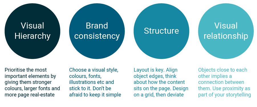
Much of visual design for learning comes down to basic design principles, which once understood can be contextualised to the individual learning situation or project. In his book ‘The Non-Designer’s Design Book’ Robin Williams defines the four basic principles of design as: Contrast, Repetition, Alignment, Proximity. Before I read Williams’ theory, I was unknowingly teaching a similar model in my own TAFE teaching work. I had labelled these basic design principles as “Visual Hierarchy’, ‘Brand Consistency’, ‘Structure’ and ‘Visual Relationships.’

Visual Hierarchy
We are bombarded with images every day. Popular opinion has each person seeing around to 4,000 ads of some kind a day.
While that seems staggeringly high to me, it poses interesting questions around brand exposure and visual burnout.
It means when we design learning, visual hierarchy has to be the first thing we consider. What is the most important information for the learner to take in first? This doesn’t just apply to images or graphics. Visual hierarchy applies to every piece of information presented to the learner. Title. Headings. Text. Menu. Graphics. Links. Activities. Buttons. Navigation. Visual thinking is deciding which of these is the most important and putting it on the highest rung on the visual ladder. What that actually means in terms of design will depend on your individual project.
Have a look at a simple version of the earlier graphic about four principles of visual design:

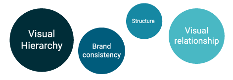
Each of the circles are the same size. While the differing colour intensity may suggest some circles are more important than others, overall, they look fairly equal. Now contrast that to the image below. Here, it is immediately obvious which elements are being positioned as more important simply because of their size.

Things to try:
- Size – make the most important elements the largest, so the eye will be attracted to them first
- Colour – We are hardwired to give visual priority to the most intensely coloured thing in our visual field. Use strong colours for ‘action’ items drawing attention to what the learner needs to do, i.e. call to action buttons, essential navigation. Keep in mind however that bright colours can be quickly over-used and will clash with each other if your colour palette is not compatible; so, use them sparingly.
Brand Consistency
Everything is branded. Every website we visit, every product we buy. Adding some stock photos into a presentation will do more visual damage than good in an environment where branding is king and our expectations have been raised. Now, I have nothing against stock photos; I use them often enough myself. The key is finding photography to match the brand you are working with. Keeping your visual style consistent will do more than just reassure the learner you know what you’re doing when it comes to visual design; it will make the learning experience itself smoother.
According to what is known as the ‘aesthetic usability effect’, people find it easier to use visually attractive things. Inconsistent visual design is jarring to the eye and will distract your learner or audience from the message or learning experience. Good design should consistently complement the content but barely be noticed.
Things to try
- Have a set colour palette which complements the brand you are working with (or create one from scratch if you’re not working with another brand) and stick to it. Be consistent with the colours of your headings / buttons / footers / visual elements. A cohesive colour palette is half the battle of visual consistency.
- Don’t use more than two fonts. Sometimes having a different heading and body text font is necessary and that’s fine; but leave it at two. More than two and it starts to be visually annoying to switch between them.
- Choose either photos or graphics or illustrations – but don’t use all of them. Choose a visual style and stick to it. Mixing stock photography with cartoon illustrations and layered infographics will be visually confusing and detract from your brand consistency.
Structure
The structure of a page – whether it’s a web-page, a presentation slide, a printable pdf or something else, is in my experience, the most fundamental aspect of visual design. By structure, I mean the layout, the use of page real-estate and the alignment. Structure and visual hierarchy work hand-in-hand in guiding a learner’s attention to what they need to read, what they need to do. A large part of our brain is wired for decoding visual input and information is easier to read if it is broken up into smaller segments.
A large chunk of plain text doesn’t draw the eye. If it’s broken down into smaller sections, interspersed with visual elements and graphics in a balanced way, it is much more enticing to read. Be careful however, of adding in visual elements just ‘for the sake of it’. Ruth Clark calls these ‘decorative visuals’. Ensure visuals or graphics which are part of your material actually help the learner, not distract them.
Things to try
- Giving structure to your visual design can be as simple as aligning your content to a 2-column grid or ensuring consistent alignment of multiple elements on a page.
- Break your content up into ‘blocks’ of information. Align these ‘blocks’ on a grid layout (this can be done either with grids and guides or just in your mind’s eye) and experiment with the arrangement until they sit well together on the page.
- If your learning module includes interaction, is it clear on the page which parts require action and which are instructions? Give separate sections a distinct feel by using icons or separating areas with horizontal or vertical lines.
Visual relationships
The meaning and importance we give to any part of a presentation is often contextual. Elements are given more importance than others based on their size relative to each other and connections are made based on the proximity between them. Use of proximity and white space is one of the most powerful visual tools you can use to complement your learning design or storytelling.
Let’s have another look at the graphic from earlier. Each circle is evenly distanced from the other circles, suggesting an even distribution of importance.

If we change the spacing between them even slightly, we immediately imply a connection between the closer items. Without any other indication, we now assume Visual Hierarchy and Brand Consistency belong to one sub-group and Structure and Visual relationship belong to a separate sub-group.

Grouping elements together will imply a relationship between them, just as lots of white space implies difference and separation. It’s interesting that good use of white space (also called negative space) is just as important as an actual graphic.
Things to try:
- When designing a page, we often think about what we can add to make it more visual. Instead, think about what can be removed. How can the existing graphic elements be better used? Simplicity in visual design is one of the most powerful principles for getting a learning message across.
- Group elements on your page / presentation so the learner can make automatic connections between them or distance them to imply separation.
These basic design principles are a good starting point for anyone thinking about visual design for learning. While they are by no means comprehensive, I like to think of them as the building blocks for all visual design, regardless of what area it is applied to. Using good basic design principles will serve any content and help make it more effective, engaging and visually attractive.
If you want to improve your visual design skills, you should join Sprout Labs next Visual design for learning program.
Iona Dierich